
The background you choose for your perfume photoshoot is more than just a backdrop; it should be an extension of the fragrance’s personality. Begin by identifying the perfume’s scent profile—whether it’s floral, woody, citrus, or oriental. This will guide your selection of background elements that reflect these characteristics. For a floral perfume, consider backgrounds with soft, romantic hues or botanical patterns. For a woody scent, opt for earthy tones and textures that evoke natural elements like wood or stone. By aligning the background with the fragrance’s scent profile, you ensure that the visual presentation complements the sensory experience.
Brand and Mood Alignment
Next, consider the brand and mood of the perfume. Is the brand known for its elegance and sophistication, or does it cater to a more playful and vibrant audience? The background should resonate with these brand attributes. For high-end, luxurious perfumes, choose backgrounds with rich textures and classic colors that exude opulence. In contrast, for more youthful or fun fragrances, you might select dynamic and colorful backgrounds that capture a sense of energy and excitement. Aligning the background with the brand’s identity and the mood of the fragrance helps create a cohesive and compelling visual narrative.
Choosing the Right Color Palette
Color plays a crucial role in setting the tone of your photoshoot. Understanding color theory can help you select a background that enhances the perfume’s appeal. Different colors evoke different emotions and associations, so choose a palette that complements the fragrance’s personality. For instance, soft pastels can enhance a delicate floral perfume, while bold, deep hues might be more suitable for a rich, oriental scent. The right color choice can subtly influence the viewer’s perception and emotional response to the fragrance, making it an essential aspect of your background selection.
Harmonizing with Bottle Design
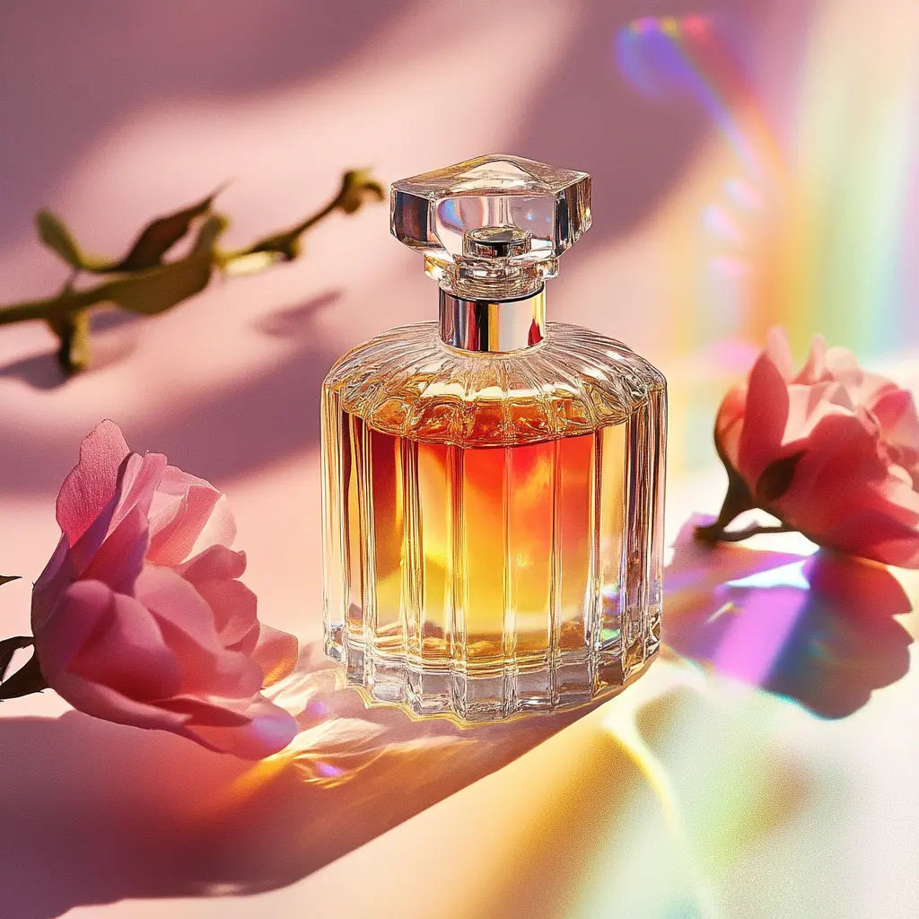
The background should not only complement the fragrance but also harmonize with the bottle’s design. Take into account the color and shape of the bottle when choosing your background. If the bottle features a striking design or vibrant color, opt for a background that provides a contrast without overpowering the product. Conversely, a more subtle background can allow a beautifully designed bottle to stand out. Ensuring that the background works well with the bottle’s aesthetics will highlight the perfume and enhance its visual appeal in the final shots.
Selecting the Perfect Texture and Material
The texture of your background plays a significant role in conveying the luxury and sophistication of a perfume. Rich, tactile materials can elevate the visual appeal of your photoshoot and emphasize the elegance of the fragrance. Consider using backgrounds with the following textures to reflect the perfume’s character:
- Silk and Satin: These materials offer a smooth, lustrous finish that can add a sense of opulence and refinement to the image. They work particularly well with high-end or classic perfumes, enhancing their luxurious feel.
- Velvet: Velvet’s plush texture provides a rich, tactile quality that can evoke a sense of indulgence and depth. It’s ideal for perfumes that aim to convey warmth and sophistication.
- Matte Finishes: A matte background can provide a clean, understated look that allows the perfume bottle to be the focal point. This finish is great for contemporary or minimalist designs, offering a modern and elegant touch.
- Textured Papers or Fabrics: Backgrounds with subtle textures or patterns, such as linen or textured papers, can add visual interest without overwhelming the perfume. These options are suitable for creating a refined, artistic presentation.
Material Compatibility
Choosing the right material for your background also involves considering how it interacts with the perfume bottle. The material should complement the bottle’s design and enhance its features without creating distractions. Here’s how to ensure material compatibility:
- Reflective Surfaces: If the perfume bottle has reflective elements, such as metallic accents or a glossy finish, select a background that supports these reflections. Glossy or semi-glossy materials can enhance the bottle’s shine and create intriguing visual effects.
- Neutral vs. Bold: For bottles with intricate designs or vibrant colors, neutral backgrounds often work best, as they provide a subtle backdrop that doesn’t compete with the bottle’s appearance. Bold backgrounds can be used effectively if the bottle itself is more subdued in color and design.
- Lighting Considerations: Different materials respond to lighting in various ways. Ensure that the background material you choose works well with your lighting setup to achieve the desired effect. For example, some materials may absorb light and appear darker, while others may reflect light and look brighter.
Lighting Considerations
Lighting is one of the most critical factors in a successful perfume photoshoot. It affects the overall look of the background and how the perfume bottle appears in the final images. Here’s a breakdown of how different lighting setups can impact your shoot:
- Natural Light: Natural light, especially diffused sunlight, can create a soft, flattering effect that enhances the perfume’s elegance. Shooting near a window or in an outdoor setting can provide a warm, natural glow. However, be mindful of the time of day and weather conditions, as these can significantly affect the lighting quality.
- Artificial Light: Artificial lighting offers more control and consistency. Using studio lights allows you to adjust the intensity and direction of the light to achieve the desired effect. Consider using softboxes or diffusers to create even lighting that reduces harsh shadows and highlights. Experiment with different light angles to find the best way to highlight the perfume bottle and background.
Highlighting the Product
Effective lighting not only illuminates the background but also emphasizes the perfume bottle. Here are some tips to ensure the product stands out:
- Key Light: Position the key light to focus on the perfume bottle, creating a highlight that draws attention to its shape and design. This primary light source should be the brightest and most direct, providing the main illumination for the product.
- Fill Light: Use fill light to soften shadows and balance the overall lighting. This light should be less intense than the key light and positioned to reduce harsh contrasts without flattening the image.
- Backlighting: Consider using backlighting to create a halo effect around the bottle. This technique can add depth and dimension to the shot, making the perfume bottle appear more dynamic and visually engaging.
By carefully selecting textures, materials, and lighting, you can create a visually stunning backdrop that enhances the beauty of your perfume and aligns with its brand identity.
Creating Depth and Interest
Adding depth to your photoshoot background can transform a flat image into a visually compelling composition. By incorporating multiple layers, you can create a sense of richness and dimension that draws the viewer’s eye. Here are some strategies for adding depth:
- Foreground Elements: Introduce elements in the foreground to frame the perfume bottle and add interest. For example, placing decorative items like crystals, flowers, or fabrics in the foreground can create a layered effect and make the bottle stand out.
- Background Props: Use props in the background to create a sense of space and context. Items such as elegant vases, ornate mirrors, or stylish display stands can add a sophisticated touch and contribute to the overall narrative of the photoshoot.
- Gradients and Shadows: Incorporate gradients or subtle shadows in your background to add depth. A background with a gradient transition or softly blended colors can provide a smooth, natural look that enhances the dimensionality of the shot.
Avoiding Clutter
While adding depth and interest is important, it’s equally crucial to avoid clutter that might distract from the perfume bottle. Here are some tips to maintain a clean and focused composition:
- Simplicity is Key: Choose background elements that complement the perfume without overwhelming it. Keep additional props or textures minimal to ensure that the bottle remains the focal point of the image.
- Balanced Composition: Arrange background elements in a way that creates a balanced and harmonious composition. Avoid placing objects or textures that could draw attention away from the perfume.
- Negative Space: Utilize negative space effectively. Leaving areas of the background empty or less detailed can help emphasize the perfume bottle and maintain a clean visual focus.
Testing and Experimenting
Before finalizing your background choice, it’s essential to take trial shots to see how different backgrounds interact with the perfume bottle. Here’s how to conduct effective trial shots:
- Varied Backgrounds: Experiment with various backgrounds to evaluate how they impact the overall look of the photoshoot. Take multiple shots with different colors, textures, and materials to determine which one best enhances the perfume.
- Lighting Tests: Test how different backgrounds respond to various lighting setups. Adjust the lighting to see how it affects the appearance of the background and the perfume bottle. This will help you identify the best combination for optimal results.
- Product Interaction: Observe how the perfume bottle interacts with each background. Check for reflections, shadows, and color contrasts to ensure that the background complements the bottle without creating unwanted effects.
Feedback and Adjustments
Once you’ve taken your trial shots, seek feedback and make adjustments as needed. Here’s how to effectively gather feedback and refine your choices:
- Peer Reviews: Share your trial shots with colleagues or clients to get their opinions. Their insights can help you identify any issues and suggest improvements.
- Client Preferences: If the photoshoot is for a specific client, consider their preferences and brand guidelines. Make adjustments based on their feedback to ensure the final images align with their vision.
- Final Tweaks: Based on the feedback and your observations, make any necessary tweaks to the background, lighting, or props. Fine-tuning these elements will help achieve a polished and professional result.
By carefully creating depth, avoiding clutter, and conducting thorough testing, you can ensure that your chosen background enhances the perfume’s visual appeal and effectively represents its character.
Collaborating with Professionals
When aiming to achieve a polished and professional look for your perfume photoshoot, collaborating with an experienced photographer is essential. Here’s how a skilled photographer can contribute to your project:
- Expertise in Composition: A professional photographer understands how to compose a shot that highlights both the perfume bottle and the background. They can balance elements, control lighting, and use techniques to create a visually appealing image.
- Technical Skills: Photographers have the technical expertise to adjust camera settings, lighting, and angles to enhance the perfume and background. Their knowledge ensures that the final images are sharp, well-lit, and free of technical flaws.
- Creative Input: A photographer can offer creative suggestions on how to best showcase the perfume with the chosen background. Their fresh perspective can bring innovative ideas to the table, improving the overall visual impact.
Working with Stylists
In addition to a photographer, a stylist can play a crucial role in arranging the background and props to enhance the perfume’s presentation:
- Styling Expertise: Stylists have an eye for detail and can select and arrange props, textures, and colors that complement the perfume. They ensure that all elements work together harmoniously to create a cohesive look.
- Attention to Detail: A stylist can address small details that might otherwise be overlooked, such as aligning props, ensuring proper color coordination, and maintaining a clean and organized setup.
- Trend Awareness: Stylists are often up-to-date with current trends and can incorporate contemporary styles and aesthetics that resonate with the target audience.
Finalizing the Look
Once the photoshoot is complete, it’s time to review the results and ensure that everything meets your expectations:
- Image Quality: Examine the images for overall quality, including sharpness, color accuracy, and composition. Ensure that the background enhances the perfume without overshadowing it.
- Consistency: Check for consistency in style and presentation across all shots. The background and perfume should have a unified look that aligns with the brand’s identity and the intended message.
- Client Approval: If the photoshoot is for a client, seek their feedback and approval on the final images. Ensure that they are satisfied with how the background complements the perfume and meets their vision.
Making Final Adjustments
After reviewing the photos, you may need to make final adjustments to perfect the images:
- Editing and Retouching: Use photo editing software to make any necessary adjustments, such as correcting colors, enhancing details, or removing imperfections. Ensure that the final edits enhance the overall look without distorting the perfume or background.
- Reshoots if Necessary: If certain aspects of the photoshoot didn’t turn out as expected, consider scheduling a reshoot. Make any changes to the background, lighting, or props based on your observations and feedback.
- Final Deliverables: Prepare the final images for delivery. Ensure that they are correctly formatted and optimized for their intended use, whether for print, online, or promotional materials.
By collaborating with professionals and thoroughly reviewing and finalizing the look, you can ensure that your perfume photoshoot achieves the desired impact and effectively showcases the perfume in the best possible light.
Frequently Asked Questions
Choosing the right background color involves considering the perfume’s scent profile and the brand’s identity. For example, if the perfume has a floral scent, soft pastel colors or botanical patterns may be appropriate. If it has a woody or oriental scent, opt for deeper, earthy tones. Additionally, ensure the background color complements the bottle’s design and doesn’t overshadow it. Use color theory to enhance the fragrance’s characteristics and evoke the desired emotions.
For a luxurious perfume photoshoot, materials that convey opulence and sophistication are ideal. Consider using textures such as silk, satin, and velvet. These materials provide a rich, tactile quality that enhances the sense of luxury. Matte finishes and textured papers or fabrics can also be effective, providing a subtle yet elegant backdrop. Choose materials that harmonize with the perfume bottle and contribute to a refined and polished look.
To ensure that lighting complements both the perfume bottle and the background, start by using a combination of natural and artificial light. Natural light can provide a soft, flattering effect, while artificial lighting allows for greater control and consistency. Position the key light to highlight the perfume bottle, and use fill light to soften shadows. Experiment with backlighting to create depth and dimension. Test various lighting setups to find the combination that best enhances the perfume and background, and make adjustments based on the results.